
Showing posts with label portraitpaintingbyjohannaspinks. Show all posts
Showing posts with label portraitpaintingbyjohannaspinks. Show all posts
Thursday, October 27, 2011


Saturday, August 15, 2009
CHEEKY CHARLIE!


For those of you that asked, my sketch from last week's class demo at LAAFA, "Cheeky Charlie" is now up for sale on Ebay.
Tuesday, July 7, 2009
Darling Dixie..


One of my favorite students, and a talented painter herself, Dixie, is returning home to Texas after a year studying at The Los Angeles Academy of Figurative Art in Van Nuys http://www.laafa.org/
DIXIE, now a grandma, had a life-long dream after a long graphic design career, world travels, and raising kids, to immerse herself for a whole year in fine art instruction at the best school she could find.
She did her research from afar and LAAFA was her chosen school. No small wonder as the faculty is great and I am proud to be part of it. So she packed up her home, rented an apartment here and came out west with her cat.
She signed up for as many classes as she could fit into a week studying with many teachers at the school. See her journey on her blog at...http://dixiekeestudio.blogspot.com/2009/04/old-dream-comes-true.html
Dixie is one reason I like to teach. Gracious as a student, patient with herself, and always thoughtful about the process... and very fun!
I got to paint her at my studio this week in Oxnard, a three hour head sketch, as a kind of 'farewell 'til we meet again' moment.
It sure was fun.
Dixie said while I was painting her, she is going to hang my head sketch 'pride of place' at her memorial. NO PRESSURE or anything. See, I told you she was funny!
Safe travels dear Dixie and PAINT PAINT PAINT every moment to delay getting to your memorial!
Monday, July 6, 2009
Apres Gnat Bite...
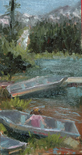

Yes, this little girl really did climb into that boat and sit and look at the waterfall in the middle of howling winds.
What are the chances of that? Catch it while you can - and quickly.
The benefits of a regular life painting discipline meeting the huge challenges of en plein air painting. One has to work quickly and not under the best of circumstances.
This sketch was done amid heavy winds, I had to hold down my sun hat and pochade box to continue, and swarms of gnats which stuck like molasses to my sun-screened arms.
A crowd also gathered to watch in those quiet mountains. There were a lot of distractions one way and another including the amazing mountain waterfall vista which seemed just too magnificent to even contemplate painting.
I was glad for those boats in the foreground. Almost like a still life. I just kept saying to myself "Just put down what you see"....and then you can go for a nice lunch! Which I did..splattered gnats and all. Washed them off with a nice Rose wine.
Sunday, June 28, 2009
Another Head Sketch Clunker...


Another head sketch clunker from life that failed to do it for me.
I am referring to the bottom one. I must have a room full of ravishing rejects now which is hard when you are trying to sell your house and clear out the studio decks which I did last week prompted by a new studio move.
I was left dissatisfied after an open house painting session at LAAFA yesterday. I didn't hate what I did but I thought I could have said it better and maybe in a more 'artful' way. So today, I did another sketch from yesterday's one, trying to work out my "issues" and spare the $$$ on an art therapist. And I liked how it came out. I like a more muted look in my paintings these days and am striving for that in my life-painting. But sometimes, too much OOOMPH and SIZZLE comes out of me.
I find this re-sketching from a life study to be quite a cathartic learning experience actually. To really look at something I have just done, paint it again on a separate canvas, and work out what you feel you could have done better. What was it that you missed? What to take to the next...
The top is today's version, 9 x12. The bottom, yesterday's, 18 x 24, about three hours with plenty of breaks and, dare I say, interruptions. It was an open house and as a teacher at the school I expected that. But I know I didn't get into the art zone at all. Today I did.
Does anyone have any good ideas for all these reject head sketches that are taking over my house and studio?
I am starting to put the ones I really like for sale on Ebay. Visit here:
This one is called "Family Jewel"...
11 x 14, oil on linen.
Tuesday, June 16, 2009
Ravishing Radish!


Two things come to mind tonight. How much I love painting still life, in between the rigors of portraiture, and how much I learn from teaching, albeit a bit of a love/hate relationship on some days if I am being very honest.
Teaching just one day a week around long school semesters, as I do, is a commitment if you are trying to do it to your very best. It is not like a workshop where you get in and out before the dust has settled and no-one really has had time to process much before the teaching check is cashed and the teacher has left amid a glitter glow.
In semester teaching, as I have done for almost three years now, people get to KNOW you and hear your repeated teaching agenda over a 10 week span and 'process" in their individual way if they are making progress. A lot of time to think. They also get to show up on days when they have private dramas (putrifying skunks caught in the attic/loved ones rushed to ER/savings lost...all true) and I have private dramas of my own ( much loved family home suddenly on the market, abrupt studio move, and putrifying menopausal face). I think there is a lot to be said for weekend workshop teaching.
Bit like "IN and OUT BURGER". Good but fast. NO commitment.
SO as a semester teacher I take that commitment on. I prepare for my class in a steadfast way that I don't think many students understand. Calls ahead to models for set ups, hunts in thrift shops to find interesting/lively set-ups. Color harmonies to think about. Thought-out 'mini' lectures, with art book examples from my personal library, to give.
This goes on week after week while planning your professional painting life around it including all sorts of other commitments, travel, sittings, shippings etc.. IT WOULD BE SO EASY TO GET LAZY. And that is where the love/hate comes in.
Having just read a great book on master painter Sergei Bongart (Sergei Bongart By Mary Balcomb) www.sergeibongart.com who painted and taught his whole career, as much concerned with teaching as painting it seems, producing a generation of highly esteemed artists to this day in his school of thinking, I know this is the level required from a teacher if you are going to do it well for your students. Not that I am close to Sergei of course.
Those in his school include Sharon Burkett Kaiser, http://www.sburkettkaiser.com/, Ovanes Berberian, www.ovanesberberian.com/ and Dan McCaw to name a few.
I certainly had my share of teachers in the past who just showed up and couldn't care less. I didn't know the difference. Then I found a teacher, my mentor, Everett Raymond Kinstler, N.A., who not only showed me how it should be done painting-wise, a journey which will take me my life time, but gave me the confidence to teach through his masterful instruction which I will be eternally grateful for as all my students know.
There are very discouraging moments teaching if I am honest which is where the hate bit comes in.
Students are like kids in candy stores. Looking for the next perfect "bon-bon" art confectionary from the teaching jar to give them the magic sweet pill of how art is done.
One student of mine went to another class recently without saying goodbye after well over two years with me. I know students always move on, that IS the journey of it. I did it in the past too, with 'class' I hope, until I found my school of 'art thinking' and knew I was home. Didn't need that wretched candy jar anymore.
But all those times spent personally teaching this afore-mentioned person, caring that it was a great lesson for said person, personal emails/critiques etc. on non-paid time...and then not so much as a handshake goodbye. STING.
I lost faith in teaching at that moment. And felt CROSS.
Why bother so much as a teacher? DETACH, I say to myself. CARE LESS. Afterall this is NOT paying the mortgage.
But then you get a nice email out of the blue tonight, which is where the LOVE comes in. from a former student who had to work SO hard to pay the $$ to study with me at an art school or two, between jobs, who is moving away from LA, and took the time to say she will never forget what I had taught her. Wow...that is why I teach. It made my day.
So... let's get to these radishes. NO big concept in mind. NO big aim to deliver a masterpiece. NO need to please a client. Just the delight of painting a few radishes after seeing how my students handled them. All of them well. But a bit too much of a reflected light here, too shiny there: these are heavy dense little beasts. Ok...dish the lesson out...now YOU paint them smart ass teacher!
I chose a cool color harmony of red and green, determined to make the leaves look abstract but good. Just like in portraiture, the hands/neck can let an artist down, so too in still life with the leaves. You will be judged by both your hands/neck and your leaves. Take time to study them all. Hmm..note to self.
Just like hands, Mr. Kinstler once said there is a whole workshop to be had around necks and to look to Sargent for that. So true. I was lucky enough on the evening of him saying that, to be standing in front of a Sargent or two at The Met. And it was a profound timely lesson. Sargent's necks were incredible. He knew what to leave out. Learn anatomy so you KNOW what to leave out. No bullet holes between the clavicle, I say. We do see a few of those! And I have done one or two myself.
We all know we don't need a radish workshop.
My new class semester starts Wednesday July 8th at LAAFA, combined portrait/still life. For all those of you taking a summer break....shame on you! But paint some radishes or a neck.
I go to France on a painting grant after the next semester ends so will be absent from teaching for while. I will chew on a baguette and brie while I am missed. Hold the radish.
Monday, June 15, 2009
"Spring Geisha"
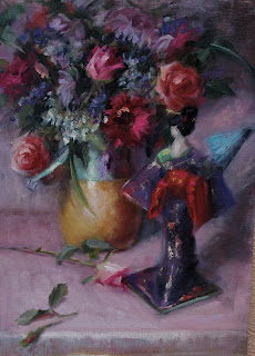
And...by popular request...here is my other finalist painting in the Jack Richeson show "Spring Geisha".
Monday, June 8, 2009
Angela Lansbury Wins Her Fifth Tony!


So m
 any congrats to Ms. Angela Lansbury who picked up her 5th Tony Award last night for her role in Blithe Spirit at the tender young age of 83 years-old.
As I watched her elegant presence on stage picking up "Best Featured Actress" , I felt honored to have painted this legendary performer for The Players' Club in New York, recently unveiled this April.
I couldn't take my eyes off her face to be honest on TV last night. And was really glad I had chosen to paint her in pearls as she so often seems to wear those. She also seems really quite tall and of course very elegant in her dress and carriage. I am hoping my 16 x 20 head and shoulders somehow caught that!
I read Ms. Lansbury's authorized biography before starting the painting, She has had one helluva career. From old Hollywood to present. From Broadway's "Mame" to TV"s iconic Jessica Fletcher on "Murder She Wrote". Ms. Lansbury, who has a love for gardening even has a rose named after her. That's why I chose to put that floral scarf on her in my portrait knowing her penchant for green fingers.
Ms. Lansbury is a reminder to us all who choose to be in The Arts that a lifetime of hard work, dedication, and practicing your craft to perfection is what it takes. Talent like she has sure helps but one just knows she has also had her share of knocks in the tough world of theatre, film and TV. Cream rises to the top. And the other good news, evidenced by Lansbury's win in her eighth decade s last night, is that those of us who want to, can go on for years and years with our performances for the sheer love of what we do.
BRAVO!!!
For the record: Angela Lansbury won her first Tony Award for leading actress in musical in 1966 for "Mame": again for "Dear World" in 1969: another in 1975 and 1979 for "Sweeney Tood": culminating in 2009 for Blithe Spirit.
Thursday, May 7, 2009
CATCH A CHARACTER IF YOU CAN!
 My class demo... Los Angeles Academy of Figurative Art.. May 6th...18x24...
If I was a guy, I would want to look like Jack Atlantis. This was our model this week and he wowed the room. Everyone loved painting him and everyone did great work.
I had brought in a huge book of Franz Hals portraits and Jack fit right into my 'catch a character if you can' lecture. Boy, Hals did it so well. Humbling stuff. Those faces were painted centuries ago but they still look very much alive. NO cameras there. Life painting all the way.
Jack has one of those handsome chameleon faces that can change into a myriad of looks, ALL good, going from charming 'pretty boy' street cool to hard-edge attitude rocker or haughty Victorian Ringmaster running a circus or country fair.
And of course, you just knew Jack had a lot going on outside of the art school room. He is a very talented musician, with an incredible voice, and a fashion designer, making a lot of the costumes he models in. Great to have the energy of this creative talent in the room. We all fed off it. www.myspace.com/jack_atlantis
He reminds me why I LOVE being a portrait painter. I might be strictly a 'one-trick' pony in the talent department (and some would argue even that) but I get to meet and paint the MOST interesting people. Last week I was in The South doing a sitting with a very special doctor who I felt much the same way about although their worlds are far apart.
This gentleman had helped raised millions for a cancer hospice and was just one of those special people who you feel privileged to meet and spend time with. You feel enriched for knowing them. They teach you.
I just don't get this feeling when I paint landscapes as hard as I try. Trees, ocean mist and misty horizons don't move me at all but people and their life stories surely do in a way that is profound.
Shhhh...don't tell anyone I said that about landscapes...
Tuesday, May 5, 2009
Walking in Molasses.
 As long as I paint, I still can't quite work out why sometimes I can paint REALLY fast, and sometimes I paint really slow. Like walking in molasses.
This was my class demo this week. I was pretty happy with it. Even the model said that I was an incredibly fast painter. And she should know. She has worked for everyone. I was able to keep this demo loose, keep the darks transparent, always a good sign, leave my cool ground showing in places, and basically not screw it up by over noodling. I knew I had put something down that was good and was able to leave it alone.
In my studio I am currently working on a commission, 30 x 40, for an out of state client which is coming along very well but is taking me forever and a day. The light is complicated and I chose the harder portrait to do, to challenge myself, and hopefully deliver a great painting.
One of the other artists in the my in-residence program asked me yesterday:"Are you having trouble with that portrait?". I didn't quite know what to say except "No, I am just taking my time getting it right!" A strangely insensitive question to ask another artist if you ask me.
I think sometimes people just assume us portrait artists whip these things out. Easy, peasy, lemon, squeezy. One, two, three, collect the check. Onto the next. NOT.
I think sometimes people look down their noses at portrait artists. An art friend told me in her Santa Monica adult art school course, she was told portrait artists were craftsmen, rather than real artists. A bit like a washing machine repairman. But hey, there is art going on here...and one just can't rush the process. Vermeer was slow too, not that I am comparing myself to him but I think of this fact often. It takes the time it takes.
This study is 18 x 24. Available for purchase.
Tuesday, April 28, 2009
Angela Lansbury Unveiled into The Players' Club.


My portrait of actress Angela Lansbury has just beenunveiled into The Players' Club of New York Hall of Fame permanent art collection organized by the prestigious club's Art Committee Chair, portraitist extraordinaire Mr. Everett Raymond Kinstler, N.A. (see adjacent pic)
WHAT A NIGHT IT WAS! ... And yes, that is a Sargent painting above my head in one of the photos below which I find rather amusing! This club has one helluva collection which I am proud to be part of. Not that I am close to a Sargent or anything!
Previous portraits of mine in the collection include Norman Rockwell and My Fair Lady's Rex Harrison, also a thrill to paint. A total of 22 prominent portrait artists from around the country were unveiled in this 'go-around' for the Hall of Fame collection.
They include Dawn Whitelaw, Michael Shane Neal, Holly Metzger, Ed Jonas, Gordon Wetmore, Wende Caporeale, Tom Donohue, Burt Silverman, Lynda Kyser Smith, Loryn Brazier, Dot Svenson, David Beynon Pena, Basil Baylin, Irene Hecht, Kyle Keith, Ian Factor, Joel Spector, Betsy Ashton, Joe Rubinstein and of course the incomparable Everett Raymond Kinstler, N.A.
I have to say, Mr. Kinstler's portrait of Christopher Plummer for the collection reminded me why I first fell in love with this great man's work. It is EVERYTHING a portrait should be and it took my breath away. Reminded me how much work I have to do.
And once again, Mr. Kinstler's 'better half', as we say in England, the ever-so elegant and witty Mrs. Peggy Kinstler had donated her considerable time to produce a lovely color keepsake program of the evening which went quickly on my studio wall. I smile when I look at it.
The Players Club was founded in 1888 by the famed actor Edwin Booth, also painted by Sargent, sadly no longer in the art collection, who envisioned a club which would bring actors into contact with men of other professions such as academics, artists, and others in the world of business. Women were admitted as members in 1988.
The club's walls ooze with history as well as the GREAT paintings. There is the Lucille Ball Loo(aka restroom) for starters but we won't go there! You can almost hear the clink-chink of ghost dry martinis from the past, guzzled down by Broadway's greats along with a waft of smoke-filled rooms as actors of old drag on the requisite cigarette before it was not cool to do that. I can only imagine the intrigue, drama, talent, fun, diamante jewelry and lacquered hair 'up-does' that these legendary club walls have been host to.
The club's executive director Mr. John Martello once again co-ordinated with Mr. Kinstler to arrange the commissions from artists all over the country, and put on a fabulous inductee evening filled with wine, dinner and divine song, with performances by Anna Bergman and Sarah Partridge, much to the crowd's enjoyment, many of whom had flown somewhat exhausted from a busy weekend at The Portrait Society of America annual conference in D.C. including Mr. Kinstler and Mr. Gordon Wetmore (chairman of The PSA).
The energy in the room lifted every ones' spirits. Among the greats taking the stage this night were also Christopher Plummer, see pic, theatre legend Marian Seldes, and Pam Singleton. Angela Lansbury is currently appearing in the Broadway smash, Blythe Spirit, and had two shows that day.
I return to my studio today inspired by it all...to be in the company of such greats of the theatre and painting arts. The club just hosted another spectacular night in its long history and I am thrilled to bits that a bit of 'me' is on its walls. I may even run out and get an up-do. NO martini though.


Tuesday, April 21, 2009
California Art Club Gold Medal Show Finalist.

It's finally here this coming weekend, The California Art Club's 96th Annual Gold Medal Juried Show of which I am a finalist.
The exhibition kicks off with an Artists' Gala Reception and Awards Ceremony, Saturday, April 25 from 6 to 9 p.m. This is your chance to be among the first to view the exhibition and purchase artwork, as well as to celebrate with all of the artists and find out who will be chosen as this year's Gold Medal Winners!
To purchase tickets, please call 626/583-9009. Tickets are $75 per person in advance/$100 at the door (includes exhibition catalogue). Advance reservations must be received no later than 12 noon on Friday, April 24.
All artwork may be viewed online and is available for acquisition.
Proceeds benefit the artists and the educational programs of the California Art Club and the Pasadena Museum of California Art.
To purchase tickets, please call 626/583-9009. Tickets are $75 per person in advance/$100 at the door (includes exhibition catalogue). Advance reservations must be received no later than 12 noon on Friday, April 24.
All artwork may be viewed online and is available for acquisition.
Proceeds benefit the artists and the educational programs of the California Art Club and the Pasadena Museum of California Art.
This is my entry "Pansies and Pear". It can be yours at the click of an internet button.
Location: Pasadena Museum of California Art
490 East Union St.
Pasadena, CA 91101
Location: Pasadena Museum of California Art
490 East Union St.
Pasadena, CA 91101
It would be great to see you there some time during the run of the exhibition, April 26 - May 17, 2009. The opening night unfortunately I will not be there but very fortunately in NYC unveiling my portrait of Angela Lansbury into The Players' Club permanent collection.
More about that excitement later.....
Thank you so much for your support!
Monday, April 13, 2009
VALUED ART QUOTES by Valued Artists


As my new class semester starts up this week teaching at LAAFA, I am brushing off my dusty teaching aides, pouring the left-over Bollinger down the sink and thinking time to get serious!
Ok...ok..it has only been two weeks and there was no Bolly and the aides aren't dusty. But I came across these quotes on the Internet, courtesy of The Painter's Keys, specifically on values which I found rather interesting and perfect timing - so I am going to share some with you!
It is all in the values. And I enjoy the challenge of them How to keep it simple. I post a portrait commission of mine, one in color, the other in black and white to show you my value thinking and how much importance I place on a simplified five value system.
John Singer Sargent - Color is an inborn gift but appreciation of value is merely training of the eye, which everyone ought to be able to acquire. ( Ahhh..from the painting God himself..JS)
Harley Brown - When it comes to values, that's when we find most paintings boring and others will knock your socks off.
William Morris Hunt - It is impossible to make a picture without values. Values are the basis. If they are not, tell me what is the basis?
Steve Childs: Value (or the use of light) is our best ally as a painter. Don't think for a minute this is not in the artist's control
Paul de Marrais: When beginning artists understand and use values for the first time, there is usually a quantum leap in the quality of their painting. (How true! Especially if they don't argue back...JS)
Ray Ward: I prefer to work on a toned ground as it makes it easier to establish the values in the early stages. (See, I am not crazy JS)
Eric Wiegardt: Problems with color are almost never problems with color. They are almost always problems with value. (What no chalky color excuse? JS)
Tom Lynch: The best way to show depth is to have variation in values. The best way to learn this is to paint without color. (Darn it..those atelier schools were on to something. Shame we stopped painting in black and white from cast for three years isn't it? We might all be really good now. JS)
Emily Moore: Bowing to value can liberate color options, so color can waltz in the back door and right on down to the front row while value is being courted at the front door. ( I don't know who Emily is but she should be a writer clearly and forget about painting. JS)
Kenn Backhaus: Establishing the two most extreme values as soon as possible helps me take note of all the other values that will fall somewhere in between.
Jean-Baptiste-Camille Corot: In preparing a study or a picture, it seems to me very important to begin by an indication of the darkest values.... and to continue in order to the lightest value. From the darkest to the lightest I would establish twenty shades.
Stephen Quiller: It is the relationship of value and intensity that is essential to using color well. If you master value and intensity, you will go a long way to expressing any mood you desire.
Barry John Raybould: Many of the most powerful paintings have the simplest value structures. That is to say, they use only two, three, for four major values. (SEE, told ya..! JS)
Theodore Robinson: My paintings cannot be a negation of what has always been and always will be necessary - drawing and search for values. (Hear, hear! JS)
Martha Saudek: You get color with your eyes wide open, your value by squinting. ( YEP! No botox for me, these are not frown lines, they are squint lines. JS)
Richard Schmid: YOu can stick with a few clear-cut values, which are stronger than a multitude of values and will obviously yield a stronger painting. But not all subjects or light conditions appear that way...be sensible and paint with values that are appropriate and faithful to your subject.
Joe Singer: To me, painting- all painting - is not so much the intelligent use of color s the intelligent use of value. If the values are right, the color cannot help but be right.
John F. A. Taylor: There are painters like Ingres who know how to dispense with hues and saturation. There is no painting which can dispense with values.
Everett Raymond Kinstler, N.A.: Think value first, then color...Ask yourself is what I am mixing relating to the light, shadow or halftone.
Monday, April 6, 2009
Geisha Kiss?


A nice two week break from teaching gives me an extra day to play, paint for myself, away from the portrait commission stuff and doing preparation for others.
I do so enjoy still life and usually have one 'set up' in a tiny room off my studio that I can make really dark. This is a still life I finished today, about two days work. It is the second bunch of flowers as the first died after I had to leave them weeks ago to get on with my work. It can be frustrating some times. There just aren't enough hours in the week.
But I do like to leave that still life set up and ready to go even if it is for a few weeks with the pot that once held the flowers looking sad waiting for his turn to be painted. Fresh flowers have to be done fast. They change by the end of the day.
I think I had a good day today. The painting, 16 x 20, on linen panel.
Overall, I was pleased with all those shades of pink, mauves and purples. Quiet a challenge. And it makes me realize that I know a lot more about color than I used thanks to playing around with the color wheel for quite some time. There was a LOT of color in this still life which I think is interesting from previous posts. How much do you grey color down, how much do you keep it raw? Personal taste seems to come into it. But sometimes it is fun just to not worry about any of it and see what you get!
By the way, this is a series of paintings I am doing with geishas. Geisha kiss?
Image copyrighted.
Sunday, April 5, 2009
Blah..blah...blah...

Here is more of me going blah...blah...blah...in a recent article on me by SCIART's eArtColumn. Thanks to Michele Dupuy Leavitt for some interesting questions. It is good to have to think once in a while.
Saturday, March 28, 2009
Marla the Muse...take two...


Ahhhh....I feel so much better.
I decided to do another study from the life study of jewelry designer Marla
Trudine (www.marlatrudine.com) this afternoon to make it more like her. Less bold color. More subdued. As I have talked about on the previous post, I can get really carried away with color.
And I don't like it anymore when I do. It makes me cross with myself. Small notes of high color work for me in the right place.
This was a very cathartic experience for me. And I may do it more often with a study I am not happy with. I have plenty of them! I KNOW how I want to paint when I paint from life, it just doesn't always work out the way I want it to.
This way, you can go back in, work out what you didn't like about your study, and put what is missing in the new one. Then you take the learning to the next. HOPEFULLY.
Marla Trudine, 8x10", oil on linen.
Visit Marla's website www.marlatrudine.com to see her one of a kind jewelry pieces.
Friday, March 27, 2009
Marla the Magnificent Muse...


It has been a while since I have had the absolute privilege to paint Marla. We worked together a few years back on a series of paintings, and were featured together in ART TALK magazine with both the model and the artist being asked "what makes an art muse?"

It is an elusive thing and I was reminded of this once again when Marla sat for my teaching class at LAAFA this week. I was excited to see her and paint her again. She always comes prepared looking amazing. Really makes the effort. And one just can't wait to get going. We had decided ahead to do a 50's movie start set-up. She couldn't be more perfect for that old Hollywood glamor look. Think retro Jayne Mansfield but with fiery red aubergine/eggplant hair.
However, I never know what I am going to get when I paint Marla. I also never quite paint her the way I see it in my head. I wanted to do a great piece but it missed the mark I fear. My husband said my head sketch looked like I had thrown myself at the canvas. Hmm.. A student said it was very bold and daring. What does that mean translated? I know the sketch had energy to say the least. And I know I enjoyed painting Marla despite around the teaching situation which presents certain challenges.
And then I think of my favorite master artists who repainted the same face time and time again, J.W. Waterhouse for instance had a "look" that he preferred in his paintings and often used the same model again and again, they didn't always have a consistency. Although Waterhouse came pretty close! Harrison Fisher is another artist I really admire whose women had a certain look and was know to rely on some model favorites. He drew like a dream and did most of his work in watercolor.
The thing is in my head I see Marla, who by the way is a very intelligent and talented jewelry design artist of quite some renown, as a delicate thing. But her exterior is super sexy (think Vargas pinup girl) and colorful, almost larger than life but in a GREAT way with terrific style, a beautiful blue tattoo over most of her back, and tons of VA-VOOM in the best possible way. That undeniable intelligence underneath it and a slight vulnerability perhaps too. It is a powerful mix.
I have decided I may do another painting using my head study for reference to see if I can quiet it down. Maybe Marla should not be quietened down at all. Maybe one should just keep on painting her. Ponder, ponder...
Hmmm...the artist's muse returns.
Monday, March 23, 2009
Clamming up with John Asaro


I have long admired the work of John Asaro and been intrigued by the story of his disappearing act into a depressive mist, dropping off the LA art radar after considerable success, becoming by popular myth a recluse. Every great artist MUST have one of those periods. I am working on mine. Hope it comes soon.
So it was great to finally meet local legend John Asaro (www.johnasaro.com) in person this Sunday at his Bergamot Station mega exhibition 'Bella Donna' featuring over 60 life-size figurative oils in all the colors of the rainbow, see previous post. For a guy in his 70's, he sure looked incredible and much younger than his years.
This guy knows how to do high-key color and apply it to the female figure in variously twisted large contorted compositions. Lots of warm and cool 'color interplay' in the skin. Lots of hard edges. Lots of lost edges. He uses red acetate glasses he told me to check his values. You can tell he is holding on to his value pattern, and then applying wild color combos on top. But he never lets go of his values. And that is what makes it all work in my opinion. Squint and it was all clear.
Some paintings are quite 'in your face'. But I was very impressed. His art voice is original. I thought some of his earlier work a tad too Sorolla-esque, many of the 'mother and child' images and beach scenes of old, featured in his now out of print book "A New Romanticism". NO, it will not be re-released. He is 'over' all of that now, he shared with me. Glad I got the book when I did. Offer me a good deal and it's yours.
Asaro taught a generation of LA artists at Art Center College of Design, Pasadena, from 1974 to 1981. He invented the Asaro planes of the head, head, to show how light falls on a face in plane form, still used in art schools today.
It was good to see the show was benefiting fine art scholarships at Art Centre. It was not so good to see that only four paintings had sold as of Saturday afternoon (mostly small ones including two of his daughter which probably means he was keeping those anyway). The show was closing just three days later and we all know that most paintings in a show are sold either before the show opens by special preview or on the night of the reception.
I felt depressed for him actually. There is only one reason an artist is hanging out at a huge gallery showing his work on a Sunday afternoon outside of a reception. To sell paintings. His show catalog, which he was graciously signing if you had paid your $30, was selling like hot cakes.
This is Asaro's big comeback. In an interesting docu-film playing at the show he said he has found his calling, painting the female figure, and through it quit depression. Dark days gone. I personally would have expected these paintings to fly off the wall. But the prices were generally high going all the way up $300,000 mark. Usually you have to be almost dead to command those kind of fees. I am glad he is not.
A lot of paintings were huge. My husband said quietly to me, he should have painted them smaller. Who can hang things this big except a museum and a few billionaires? Who can afford them in this economy? Except a museum and a few billionaires. Also, those 'in your face nudes', might have put some off. Not quite right for the dining room.
Maybe sales were not his agenda. I suspect not. But this collection took three years to paint he told me. Everyone needs to eat. I loved one clip in the film where he squeezed out a whole tube of Old Holland red on his palette in one go. He obviously gets through a lot. NO skimping on materials here.
Asaro is as superb a draftsman of the human form as any I have seen. His color is glorious. . His value range killer. His cast shadow treatment, merging in and out of the human form in shadow, magnificent.
So I was determined to have a bit of a chit-chat with him. But I could see, as other people approached him, he was not effusive in nature. A man of few words for a stranger. A bit guarded. Mine was a very one-sided chat really. I have seen clams in hot garlic broth open up more. But I kept on at him.
Fortunately I was wearing a big hat so he just thought I was one of those menopausal crazies. He had no interest in me at all despite me clearly knowing quite a lot about him and surprising him with super-intelligent questions. Knew for instance that he had used Sara Streeter in a lot of the work, see previous post, and other tid-bits of Asaro history. It was also obvious I knew a few people in the room and was in the art world, not a stalker.
I would have thought that would have sparked at least just one 'two-sided' sentence. A flicker of interest. Alas, no.
The only time I saw a real spark in him, was when one of my students who I bumped into at the show, came up to join me trying to converse with him. She is VERY beautiful, think Angelina Jolie, and he instantly wanted to paint her of course. Gave her his card...come up and be in my etcings...ah....the life of a male artist. He perked right up! Charming.
To tell you how good the show was for me, after I left I found myself going back for another hour just to really study his work again. Now he really thought I was stalker status. There was so much to learn from him. He is still a great teacher. And Asaro's new direction in his art speaks for itself. Wonderful.
If I had the space and money, he would be hanging on my walls.
Thursday, March 12, 2009
LICORICE ALLSORTS and M&M's


 AS a teeny tiny tot growing up in England we had a candy called LICORICE ALLSORTS, see top picture, and then think M&M's for the tasty American translation. High- key colored delectable edibles.
I devoured these treats with gusto as only a kid can and I still hunt them down at ex-pat British foodie stories All that neon-glo color! It EXCITES ME. Grrrrrr...
But, truth be told, these color candies all tasted exactly the same. Pink interchanged with orange or blue. Basically color overkill with no subtlety of flavor which brings me to my painting journey, especially when I paint from life.
I was thinking about color overkill today. Why exactly did I liked the study I did in my teaching class at LAAFA this morning and why I don't like an awful lot of studies from thenot so recent past?
IN my adult art life one of the biggest problems I have faced (and there have been MANY), is having this urge to paint high key "raw" color. Give me a hot sugar pink or ice blue and I wanna slap it down. Pure unadulterated art bliss. Just like those childhood candies.
I see these beautiful tonal painters, Jeremy Lipking, la-di-da, but when that fuchsia pink is in front of me, well, padlock me down. I just don't want to grey it down at all. Embarrassing in a Lipking workshop...I was there! Paint fuchsia on my art tombstone...may she R.I.P....Rest in Pink, the hotter the better. Quote me on that.
Look to Ovanes Berberian for an artist who I think does high-key color just right! (www.totalartsgallery.com). Not easy.
So I was somewhat pleased today when the model turned up in a Licorice Allsorts colored head wrap. Most of the delightful Marina, from my angle, was in light shadow. But in that light shadow, I still saw that sugar plum pink, candy apple green, and Dunkin' Donut blue. Don't you just marvel at blue icing?
I held back deliberately. Kept it muted. I was so proud of myself.
I prepare for my class, a combined still life and portrait from the model event. I take in props, whatever it takes to make the class inspired to paint. This can take quite some prep. time which I don't think students always realize.
At 7 a.m. today I was mixing a rainbow of colors on my palette around the color wheel, mixed from only three primaries, (see palette picture), cad. yellow, magenta, cyan blue. Yes, the old printers' color wheel. Still-life was daffodils today. Now that it sheer 'yellow' magnificence and one has to be prepared.
I have a feeling of wonder when I see what just three high key colors can mix. It amazes me EVERY time. All these people who want the perfect answer to color...the perfect tube of paint to buy from the art store to get you straight in to art history?...
Try just experimenting mixing from any three versions of the primaries (red, yellow and blue) and see what can happen. See what you can learn about color from doing it repeatedly over a LONG period of time. See what you can learn about color from changing those three primaries, say, going toward yellow ochre, alizarin crimson and ultramarine blue? Or vermillion, yellow ochre and black (Zorn palette).
Cut back to the candy chase...today I dipped into that Licorice Allsorts-esque color wheel on my palette sparingly during my one hour of painting around teaching. It was there when I needed it which I surely did. But I kept it subdued.
Restraint, and an understanding of raw color, used in just small tiny tot bites....ahhh...Now hand over the Licorice Allsorts. Prompto.
I'll get very gray otherwise.
Tuesday, February 24, 2009
FACE TO FACE With the past.


Recently I had the delight of going to The Vanity Fair Portrait Exhibit at LACMA in Los Angeles featuring 100 years of VF photo portraits. Great show.
It reminded me of the old days before my portrait career when I was a Hollywood makeup gal fixing the faces of stars. See first image upper left from Vanity Fair. That's me shooting the breeze with Shelley Winters and Carroll Baker in curlers, hers not mine. I was part of a Vanity Fair 1995 mega shoot with Herb Ritts and Annie Leibovitz in 1995. And when I say mega, consider this; 210 people to shoot and one dog, 1,276 dresses, 295 bras (!!!), and 662 pairs of high heels. It was a HUGE crew in hangar with a helluva crowd to feed for lunch. I really miss craft services still. Someone swanning around offering you a custom-made eggwhite omlette and frappa-whappa coffee at 11 a.m.!
I know I earned way more money then than I do now. Hey, like Naomi Campbell I didn't get out of bed for less that $10,000 a day.
But my art was washed off at the end of the day and rarely stood the test of portfolio time, let alone a careless cup of coffee or ciggie (models ALL smoke) smearing my perfectly applied lips. Happened ALL the time and used to really tick me off. Drink through a straw please! Forget someone crying through my perfectly curled fake lashes. That would send me DUO Glue frickin' nuts. I don't care what caused the tears. Makeup people aren't always treated that well. I used to HATE being called "THE MAKEUP GIRL", that I can tell you.
You are the first to arrive and the last to leave and LOW on the roll of credits. Just look at movie credits. Makeup people are way down the list. But if you mess up what is in your makeup chair at 4 a.m., the WHOLE day's shoot can go to pieces.
I haven't looked at my old portfolio and magazine covers/clippings for YEARS. Kind of turned my back on the whole darn thing after an illness made me leave my agency and eventually devote myself to "painting" art.
But I suddenly and unexpectedly had this huge sudden sense of pride at the VF show at LACMA that I had once done this. Been part of this crazy world.
It has been so rewarding going back through the old clippings. My old life. Face to face with my past comparing notes on how my art is today compared to then. How much I know now that I didn't know then.
Can I say, (I hardly dare) that I really didn't realize how good I was as a makeup artist? That I really was artistic with all this goop. I hardly dared call myself an 'artist' in those days.
Ahhhh....sweet reunion of sorts. Certainly got me thinking...
Makeup by Johanna Spinks (bottom two images). All images Copyrighted.
Subscribe to:
Posts (Atom)